< Back
I am currently working on a web-and-mobile application that shows the user their calendar events in map form. This app could be useful for several types of professionals - such as sales people, moving crews, plumbers, etc. - as well as for planning road trips and other types of multi-stop travel. My goals with this project are to explore branding, gain more experience prototyping (in Google Slides and InVision) and designing (in Illustrator and Photoshop). A stretch goal is to teach myself some animation skills and use them (hopefully) tastefully.
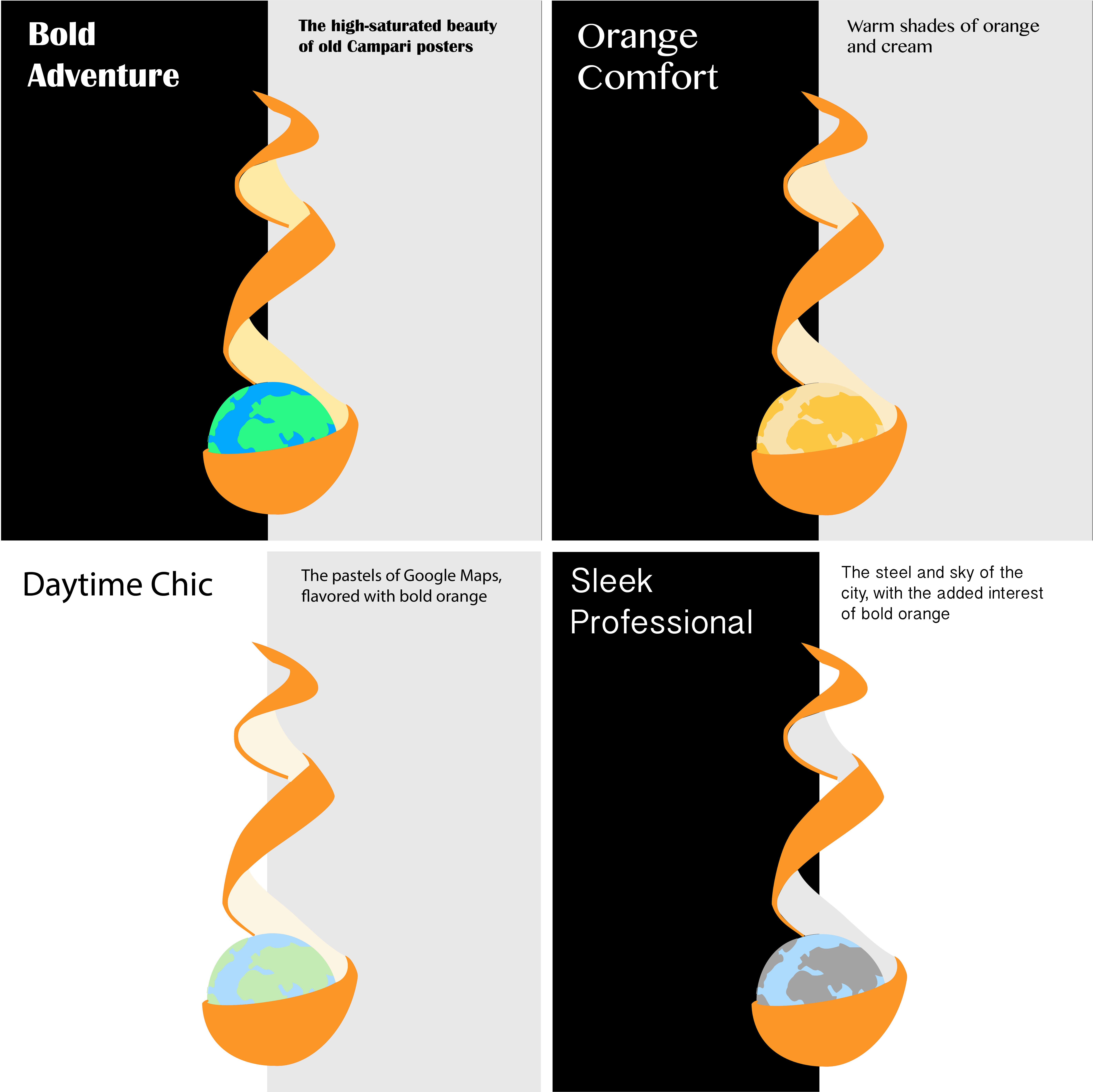
To develop the logo, I used layers in Illustrator to experiment with color schemes, then chose four themes to fill out with brand personality (i.e. gave each a title and font). The bold orange color and peeled orange shape are the memorable aspects of the brand. The below color schemes and fonts will be evaluated in preference testing, where I will ask representative users how they envision using the app (e.g. adventure, day-to-day, professional only, etc.), see if they remember which logo was presented (of a few options) to measure memorability, and ask for their opinions on these four brand ideas. In the below designs, the left background color is the splash screen color, and the right color is the Google Maps gray. I did this to imagine each logo in both environments.
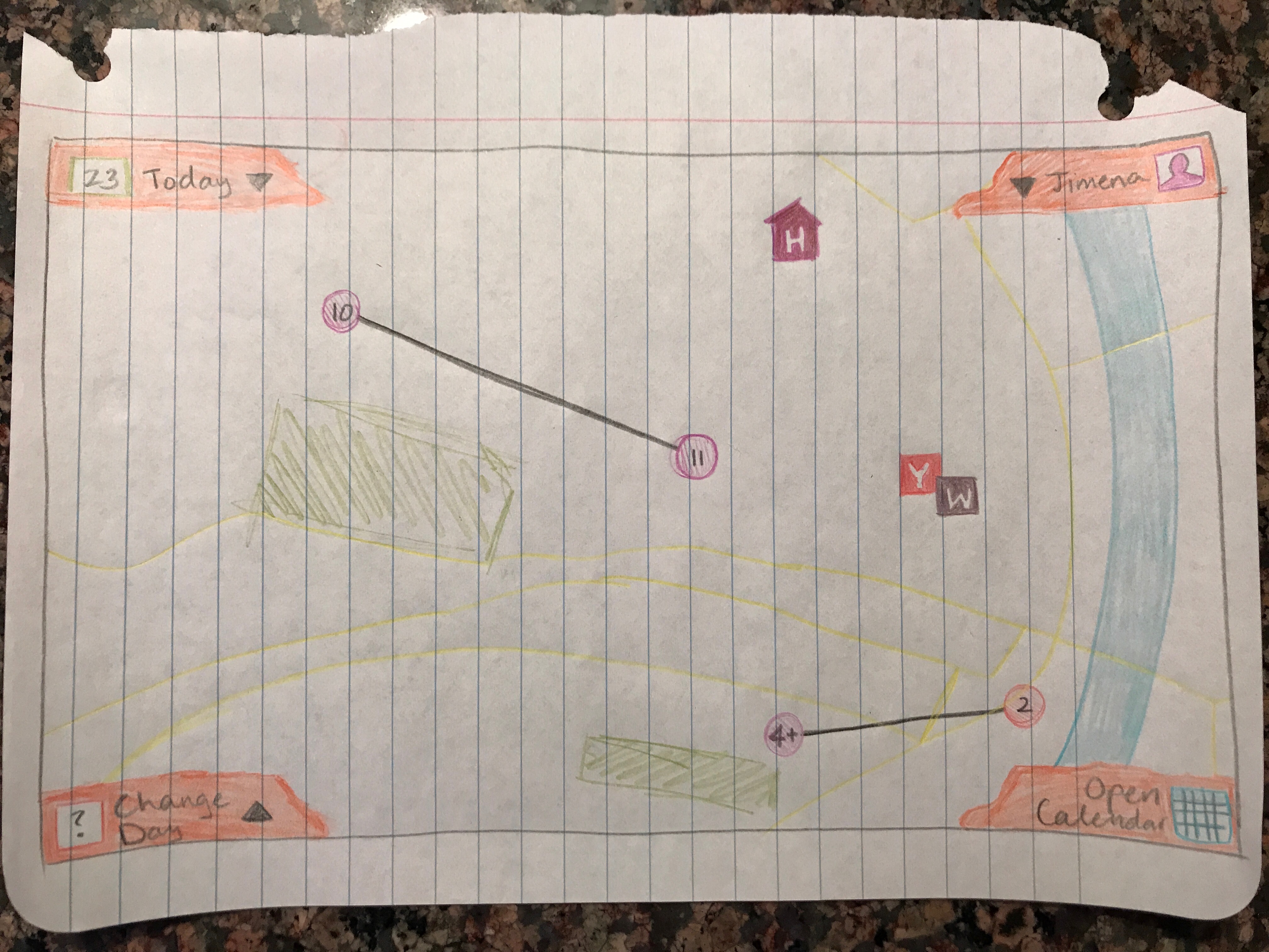
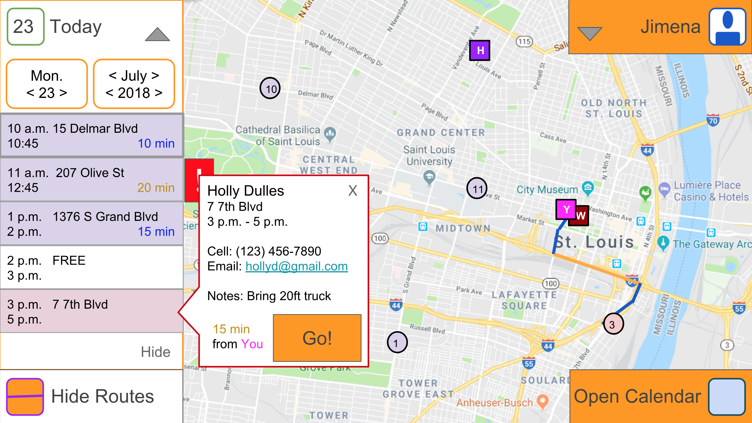
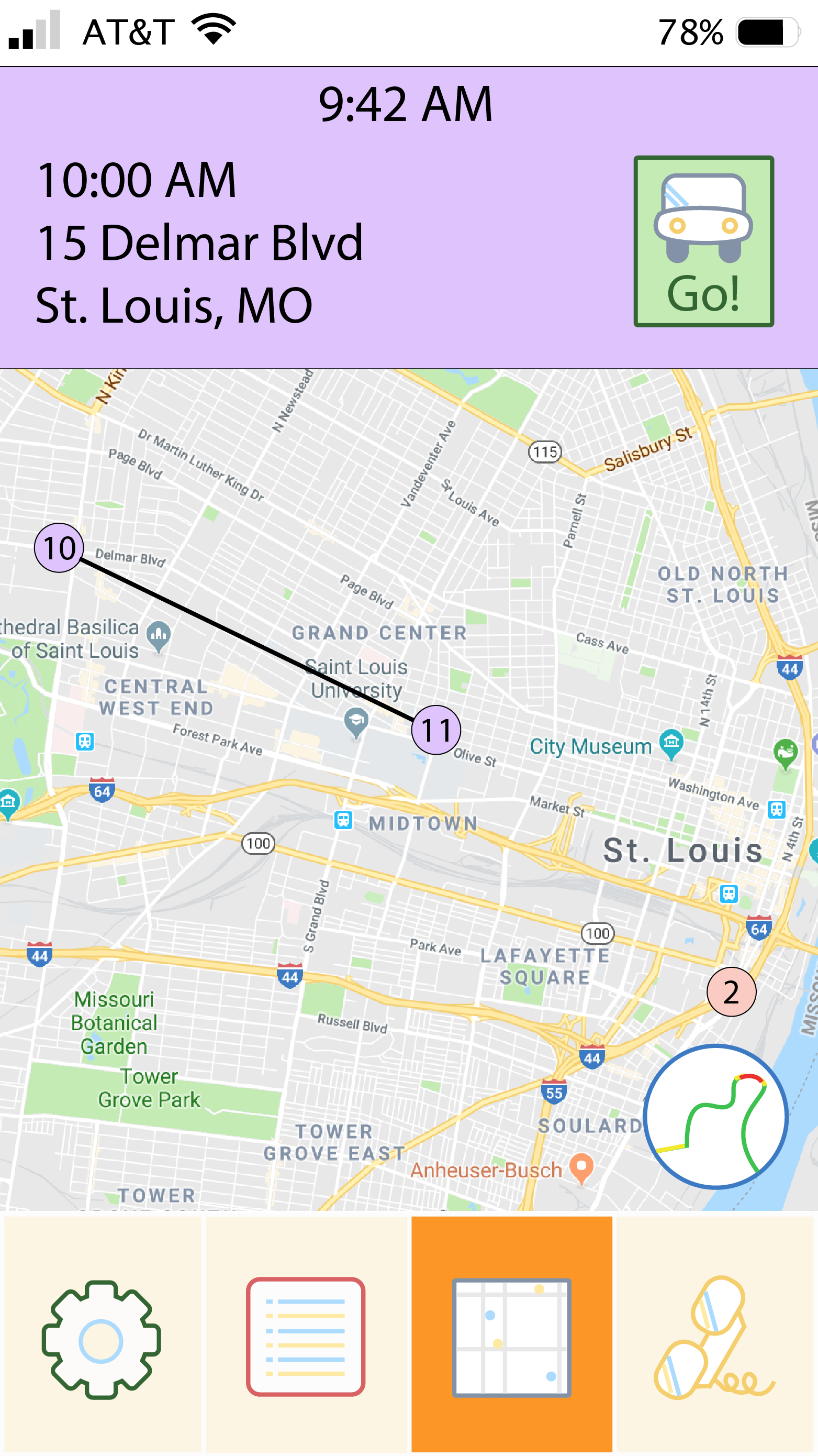
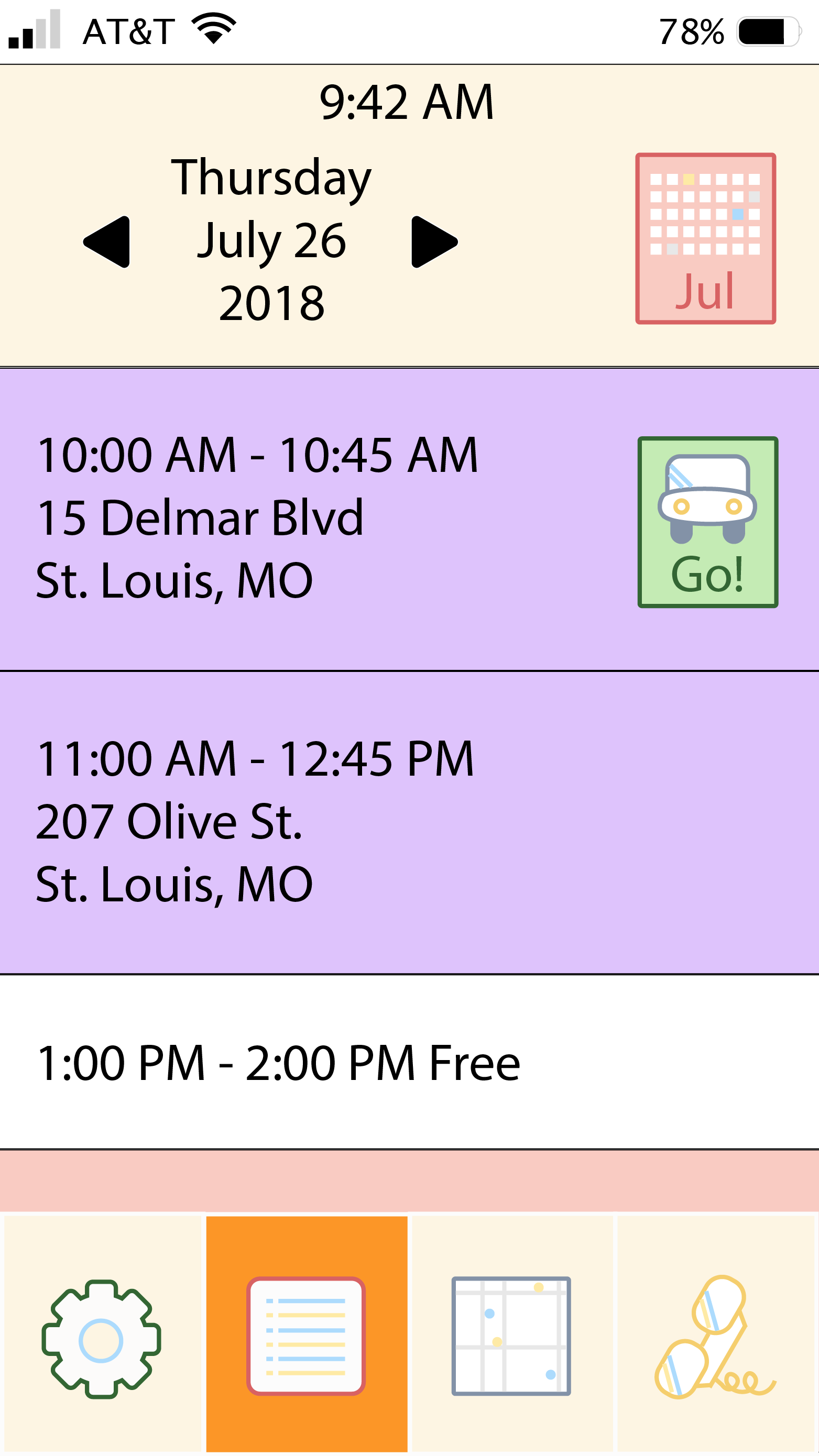
The below sketches show one possible layout for the main page of the web app (there will also be a mobile app). Events are linked on the map only when one directly follows the next; when there is free time, no line connects the event sites. Events are color-coded in the same schema the user uses in their calendar app. Home ('H') and work ('W') can be saved to a user's profile, and their current postion is also shown ('Y' for "You are here"). Lastly, the orange trapezoids in the corners are bits of orange peel, to keep with the theme.
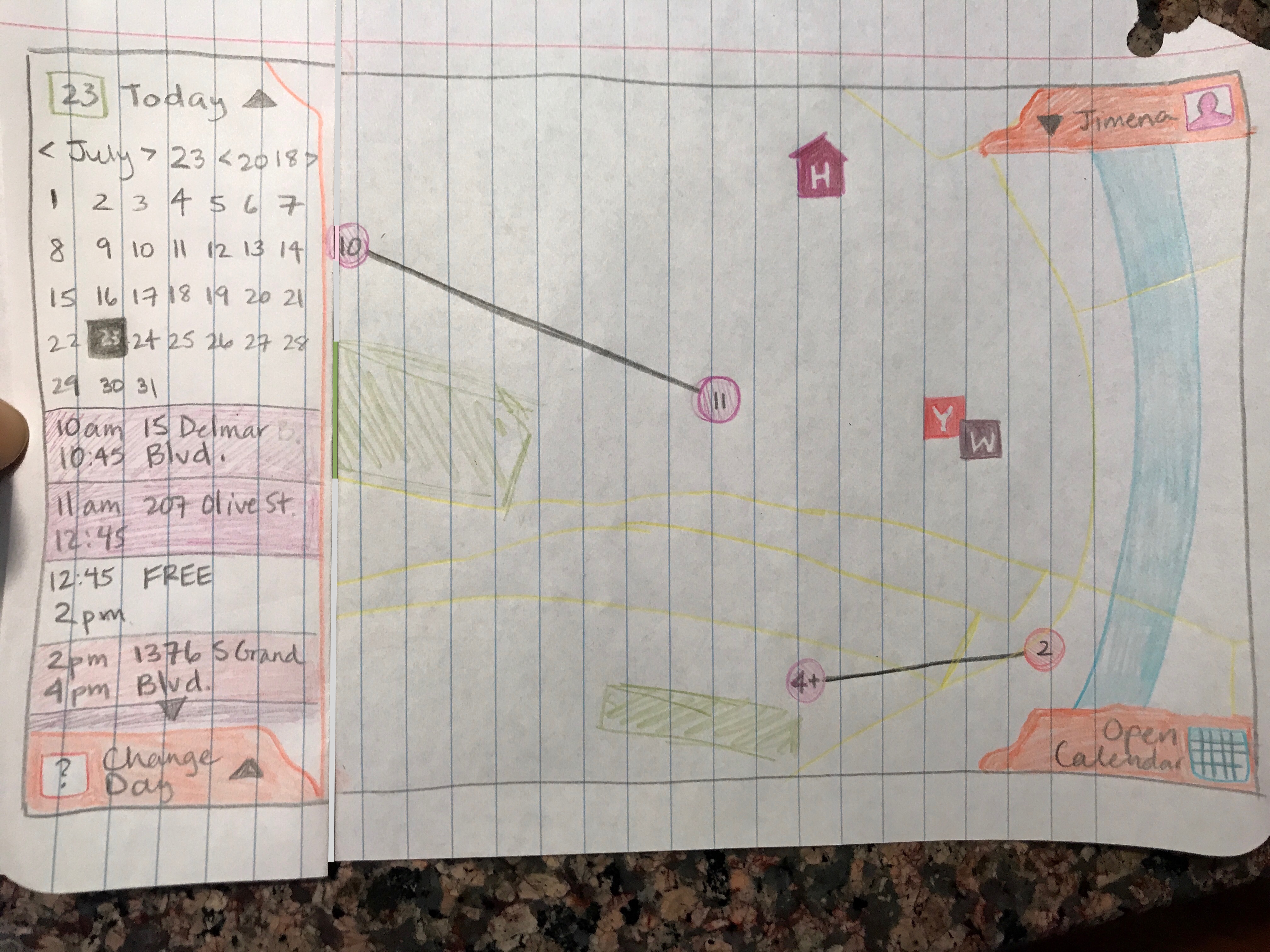
After sketching, I made wireframes in Google Slides and hyperlinked them to feel the workflow. I turned those wireframes into (simple) mockups and tested these with two representative users. Through this process, three features were added: the "Show/Hide Routes" button, which toggles showing mapped routes vs. straight lines between event locations; the warning popup that the user may not arrive at the next destination on time; and the event information popup.
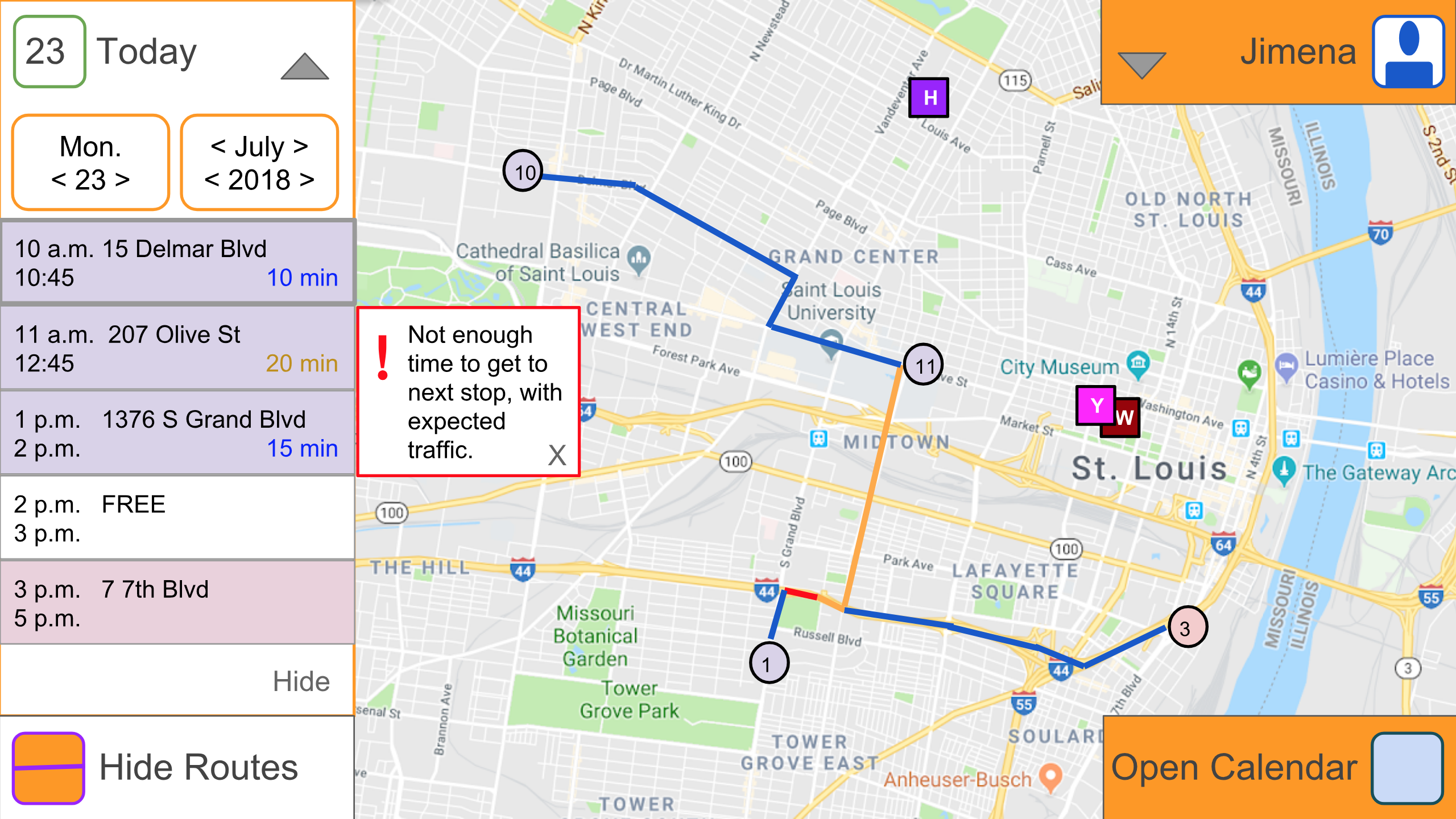
I made higher-fidelity mockups in Illustrator for the mobile sample screens. Once all details (e.g., button states) necessary for my user testing tasks are complete, I will use InVision to create a mobile prototype and test it with representative users.
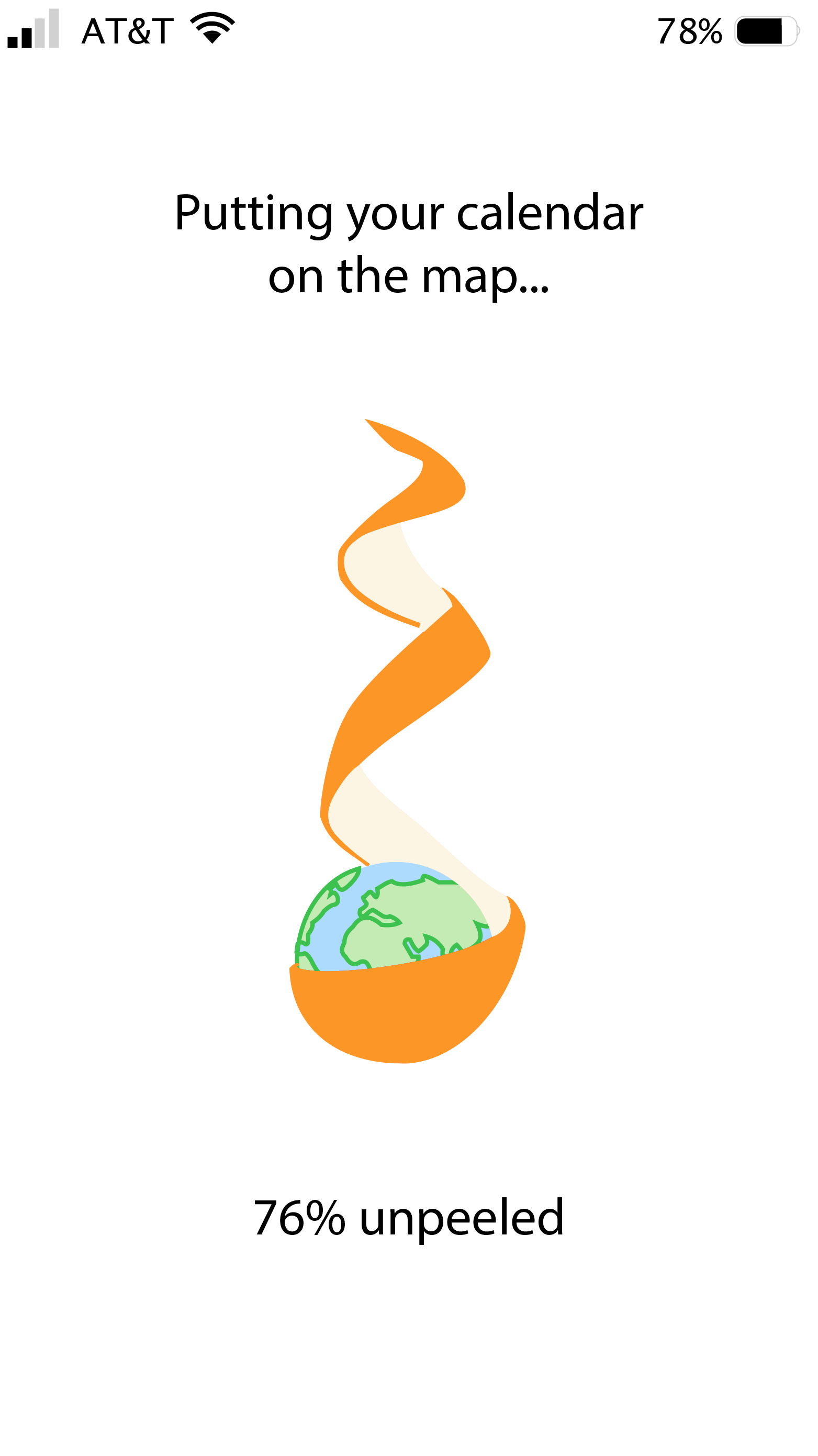
Animation will take place on the loading screen: the orange will be peeled in a spiral motion as the user's calendar (e.g. iCal, Google Calendar, etc.) syncronizes with this app. I have not yet decided if this unpeeling animation will be a smooth motion or a jagged motion that imitates how one truly unpeels an orange.
Current actions completed or in progress:
Check back in a few weeks to see how the app evolves! Next steps include:
< Back